A STELLAR Rebrand
After many years of growing and acquiring different companies in different regions Projekt202 was experiencing an identity crisis of sorts. All of the acquired companies were still operating as if they were separate entities and we quickly needed to unify under a new brand and a connected way of thinking.


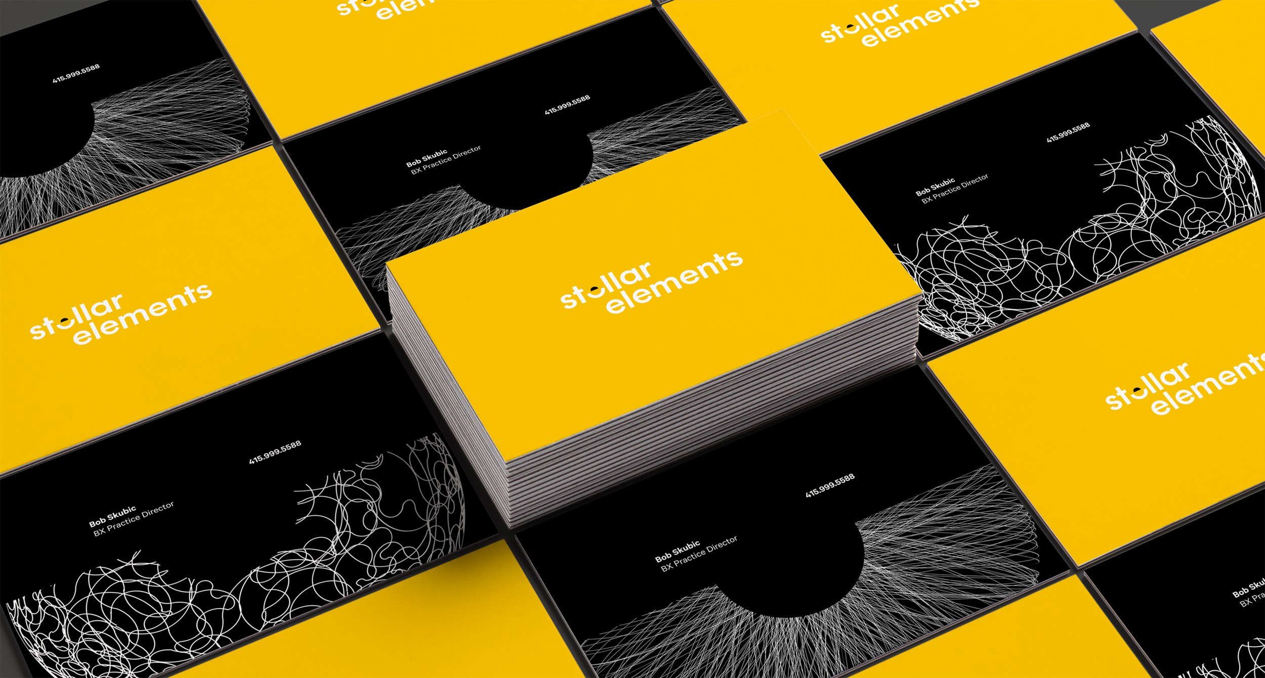
Above is a small sample of logos from the rebrand, exploring logotypes and marks that capture our mission:
finding a North Star and uncovering what’s hidden through Brand Experience Design.


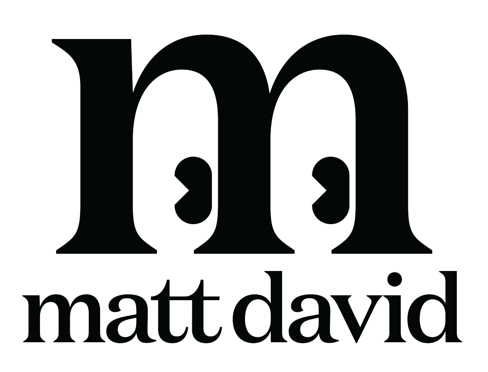
Ideas and explorations were wide at first but ideas quickly crystalized around a logotype more than a logo mark.
The restraint of taking away and looking deeper was a great way to focus on the letterforms, and then it was a matter of choosing the special letter.


SOCIAL POSTS
With uncertain ad spend, we focused early on creating social expressions of our brand and point of view to stand out from other consultancies.


SITE DESIGN
The rebrand extended to the site, showcasing the brand’s look, content volume, and design sensibility—bringing the “Looking Deeper” concept to life through flexible illustrations.

WELCOME KIT
Thinking of new employees, we wanted swag that felt worth keeping, not wasteful like before. Keeping the design simple and thoughtful, we created notebooks printed with a pointillized portrait of each recipient—made possible by a clever bit of software that turns full-color images into something unique with minimal experimentation.

