

OPENMARKET Branding Refresh
With more than 20 years of experience in enterprise mobile messaging, OpenMarket as a brand was looking more dated than the flagship product Indigo did at the time of it’s launch. They asked to have a small refresh to bring them inline with the new product and find a way to share some common characteristics. The starting point was a slight modification to the logo mark, creating more volume in the shape and then updating the word mark with a more modern open typeface that fits better with Indigo.
UNIFYING BRAND COLORS
Starting with the original and current OpenMarket color family, the goal was to unify it with the color family of Indigo and to do this we explored small steps in that direction to achieve the desired effect.


Website Component Designs
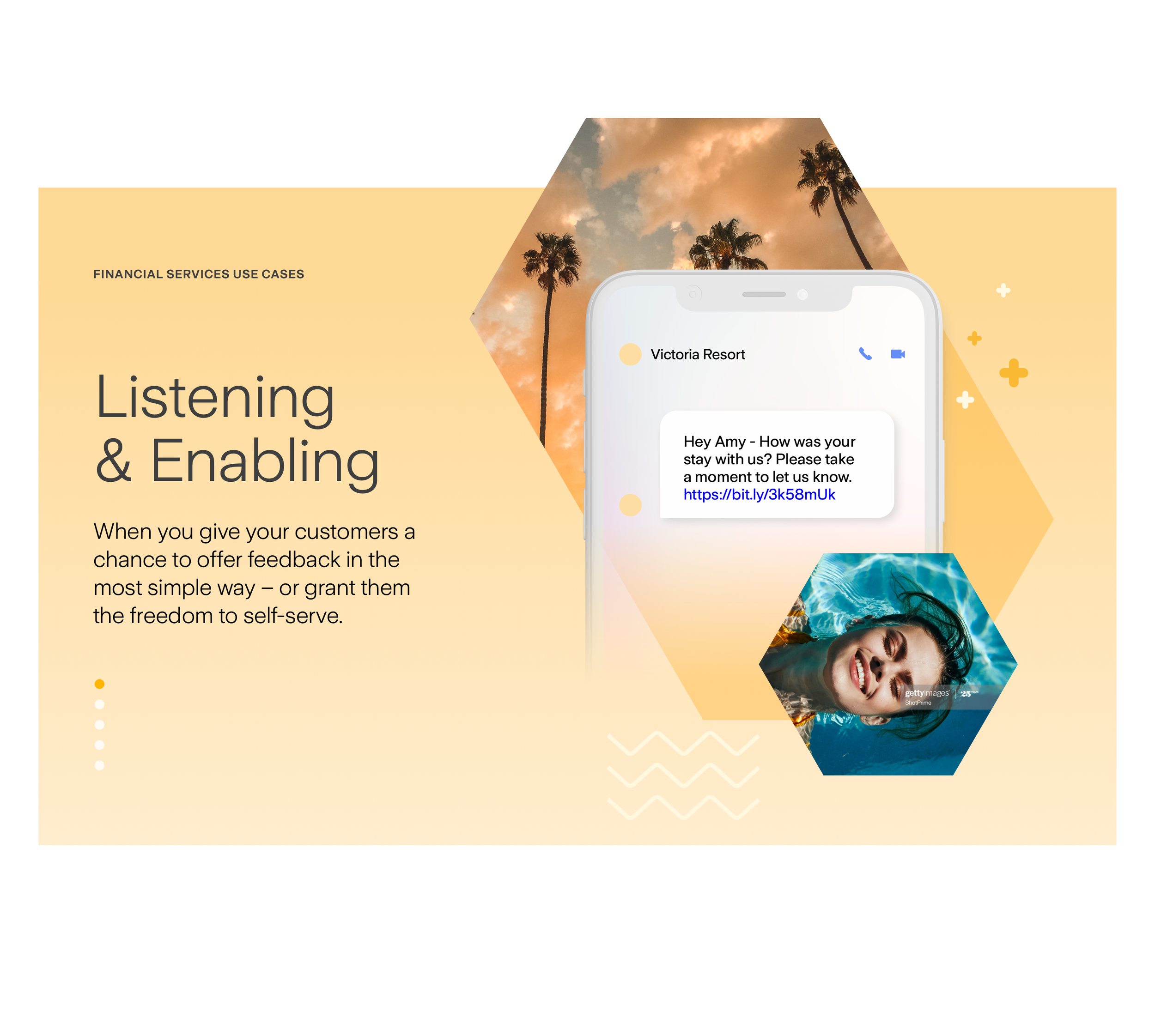
In the course of exploring the new branding for OpenMarket, new website design components were tested out for color and graphic language as well a refresh of the potential photography styles to help update the brand.


APPEARING EVERYWHERE
With a new graphic language and patterns we could start to apply these to solve the problem of representing the OpenMarket platform as a dynamic tool to reach customers everywhere and at anytime with the crucial information that generates trust.