
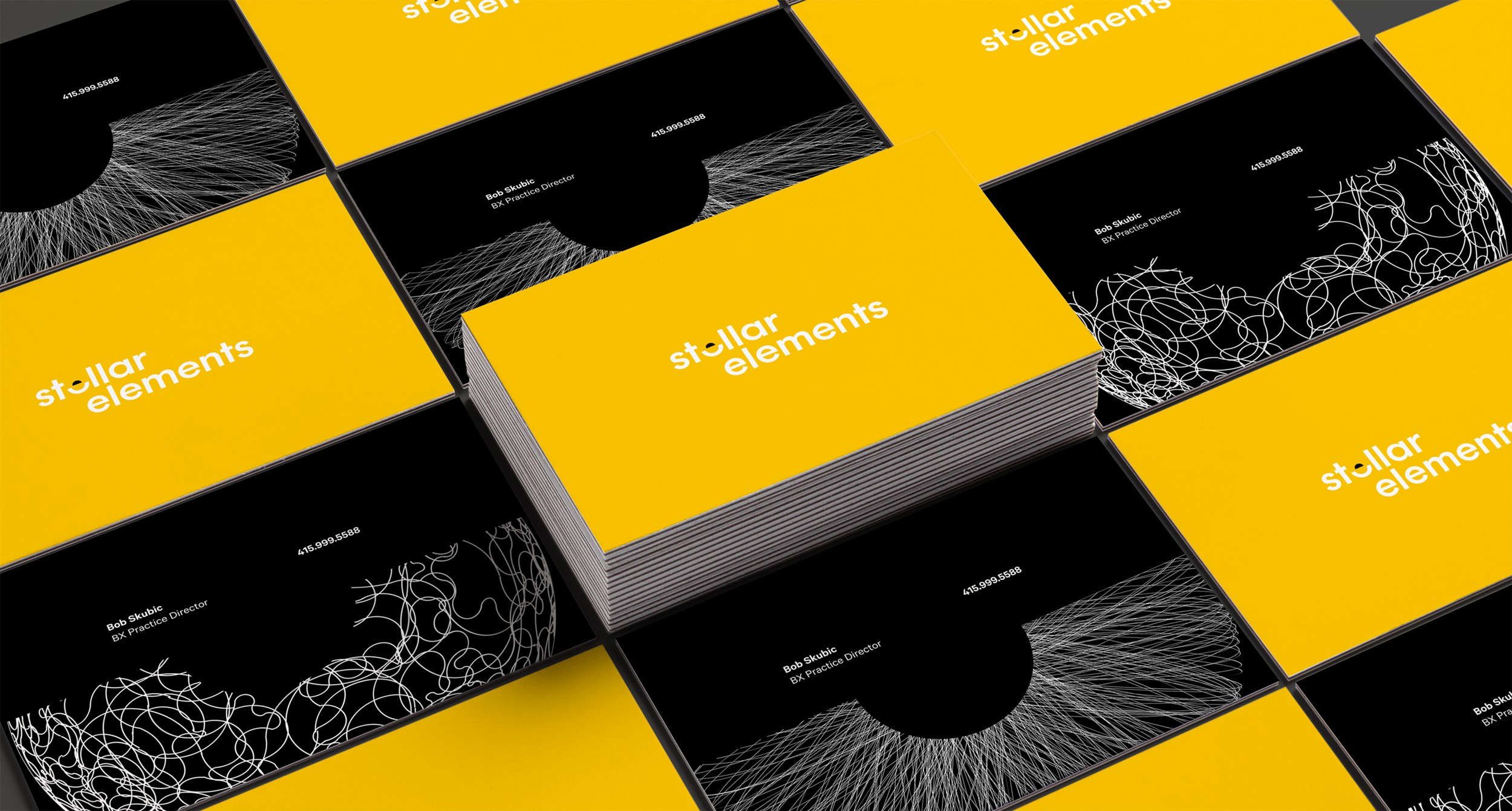
A STELLAR Rebrand
After many years of growing and acquiring different companies in different regions Projekt202 was experiencing an identity crisis of sorts. All of the acquired companies were still operating as if they were separate entities and we quickly needed to unify under a new brand and a connected way of thinking.


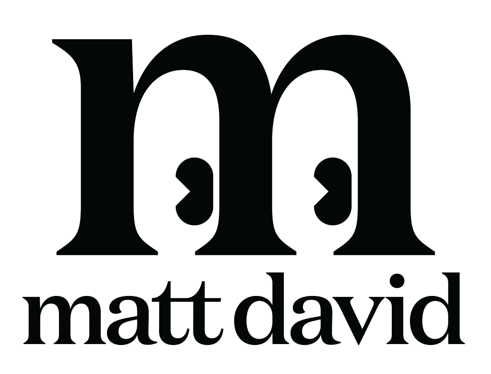
Ideas and explorations were wide at first but ideas quickly crystalized around a logotype more than a logo mark.
The restraint of taking away and looking deeper was a great way to focus on the letterforms, and then it was a matter of choosing the special letter.


SOCIAL POSTS
Without knowing how much paid advertising we would have to introduce our brand it became important to develop some social expressions of our brand and our point of view in the early days if we were to stand apart from other consultancies.


SITE DESIGN
Designs for the rebrand extended to the site design but mostly to show a flavor of the brand and a volume of the content and design sensibility.
Extending the visual language to illustration and showing the flexibility of the concept “Looking Deeper”.

WELCOME KIT
Consideration for the new employees was given and although i’m not opposed to swag it seemed important to make something that would be worth keeping after seeing so much waste generated under the name of the previous company. It made sense to keep things simple and the design thoughtful. Notebooks were to be printed with a pointalized image of the recipient thanks to a neat little bit of software that processes full color images with only a little experimentation.

