

REFRESH CX
Leader in the Contact Center Game for longer than anyone Five9 was in need of a refresh to remind all of the customers and the upstarts that they were not just an old dog but had new tricks. The existing logo was visually tied to the cloud with it’s symbolism back when being cloud based was a game changer. But now they were feeling dated and slightly burdened by the bulky top heavy logo in applications.


COLOR FAMILY
Five9 felt strongly that in such a competitive landscape they needed to evolve the color family to be more sophisticated but retain some equity in the established Primary color. However they were experiencing some issues of balancing this Magenta with another bold color and needed a solution that harmonized colors and supported the primary better. So an extensive exploration was done testing out colors and volumes of colors in layouts before finding the best solution for them going forward.


BRANDING APPLICATIONS
To test out the brand system in all of it’s potential applications the team I worked with needed to show a variety of layouts that can take advantage of voice and tone as well as dries and patterns as well as photography styles that are suitable for this visual direction.

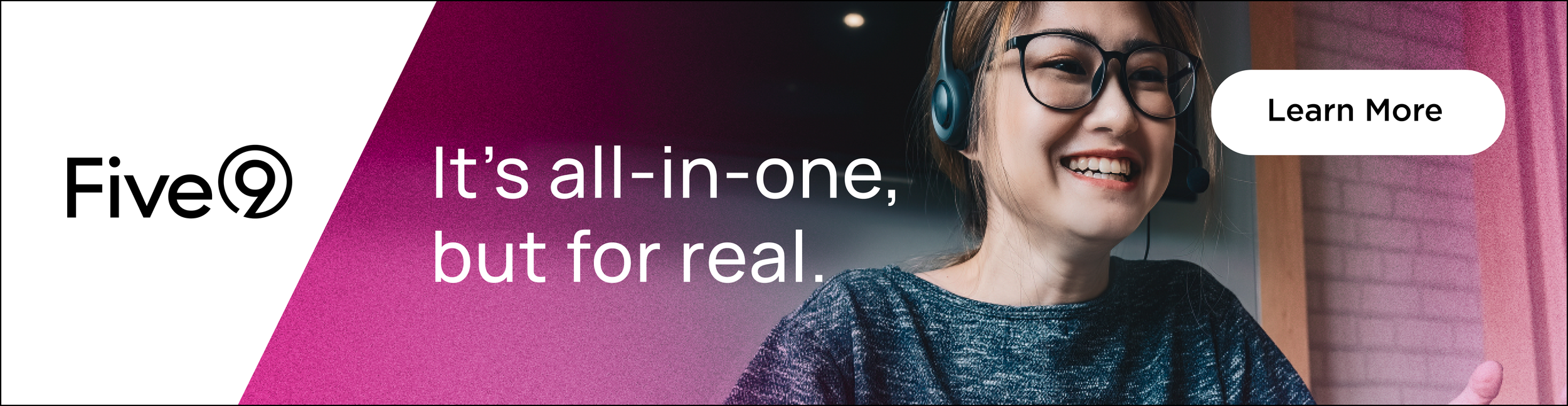
BANNERS and SOCIAL
Leader in the Contact Center Game for longer than anyone Five9 was in need of a refresh to remind all of the customers and the upstarts that they were not just an old dog but had new tricks. The existing logo was visually tied to the cloud with it’s symbolism back when being cloud based was a game changer. But now they were feeling dated and slightly burdened by the bulky top heavy logo in applications.


SIMPLICITY and STRENGTH
As the visual design of the brand was being developed Five9 needed to see how it would work in the most commonly used applications. The system needed to be simple enough to maintain consistency and be compelling enough externally in sales applications.


